Motion
Designing brands that move
Logos and layouts now live on screens that scroll, swipe and play. Here is how we design identities that hold up in motion, not just in a PDF.
Date:
Mar 18, 2025
Author:
Leo Hartmann
001
Start Still
Every good motion identity starts as a strong still one. Before anything moves, we make sure the logo, type and colour work at the size of a favicon and the size of a billboard.
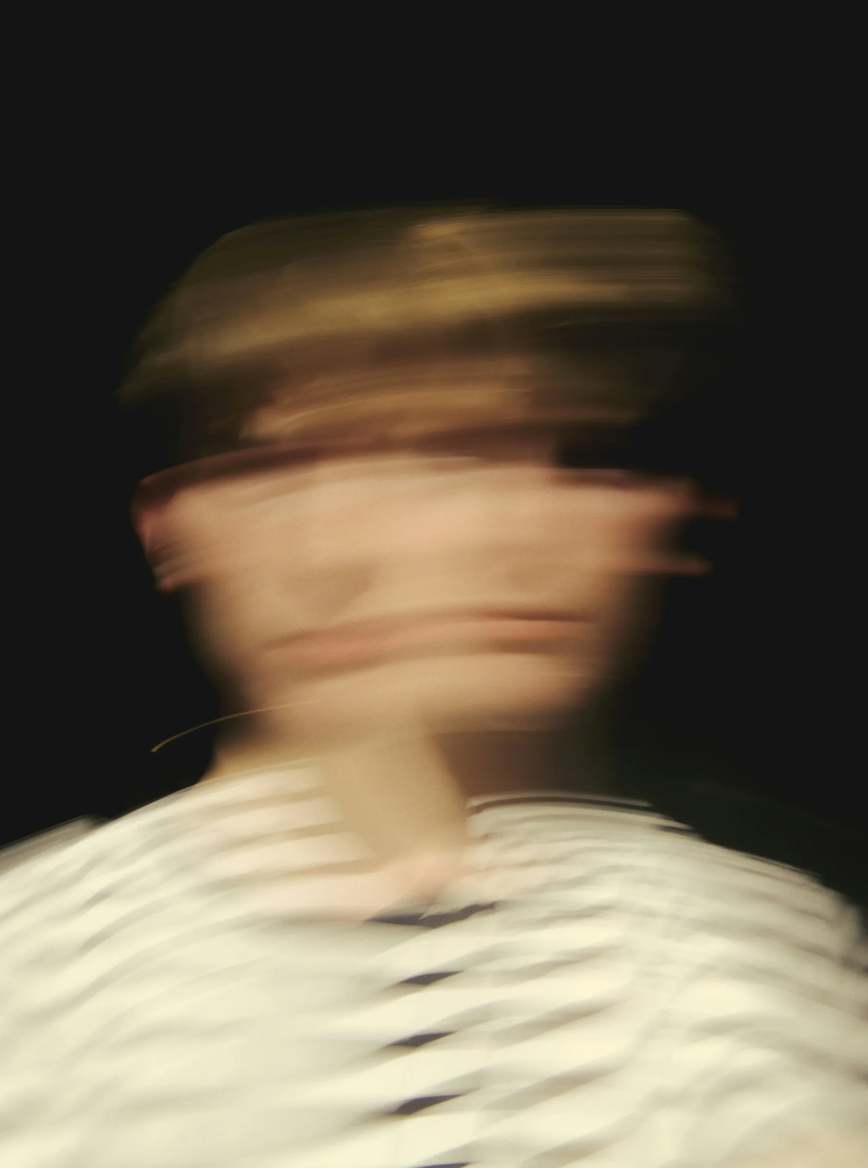
Once the static system is solid, we ask a simple question: if this brand moved, how would it move? Fast or slow, springy or smooth, playful or precise? Writing those answers down early saves weeks of animation that looks great on its own but feels wrong for the brand.
002
Rhythm
Motion has a tempo, just like music. We pick a small set of durations and easing curves and use them everywhere, from a button hover to a thirty-second launch film. That shared rhythm is what makes a brand feel familiar even when the content changes.
We document that rhythm the same way we document colour: a few named values, clear examples and short rules for when to use each one. Developers and editors can then make new pieces without asking us, and the brand still feels like itself across every channel.

003
Restraint
The most common mistake we see is too much movement. When everything animates, nothing stands out, and people start to scroll past. We usually give each screen one moment of motion that carries the message, and keep everything else calm and still.
Restraint also helps performance and accessibility. Fewer, simpler animations load faster, drain less battery and are easier to switch off for people who prefer reduced motion. A brand that respects its audience in small ways tends to earn trust in big ones.

004
Testing
We test motion where people will actually see it: on cheap phones, in bright sunlight, inside busy social feeds. A transition that feels elegant on a studio monitor can feel sluggish on a train, so we review everything on real devices before sign-off.
Finally, we hand over motion as a living toolkit rather than a finished film. Clear templates, sample files and a short guide mean the in-house team can keep the brand moving long after our project ends, and keep it moving well.
More Articles
Keep reading